
75th Anniversary Guidelines
This is a guide to the elements that make up the Kentucky Eagle 75th Anniversary campaign. It includes rules and sample executions that demonstrate how to bring our identity to life.
Logos
Primary Logo
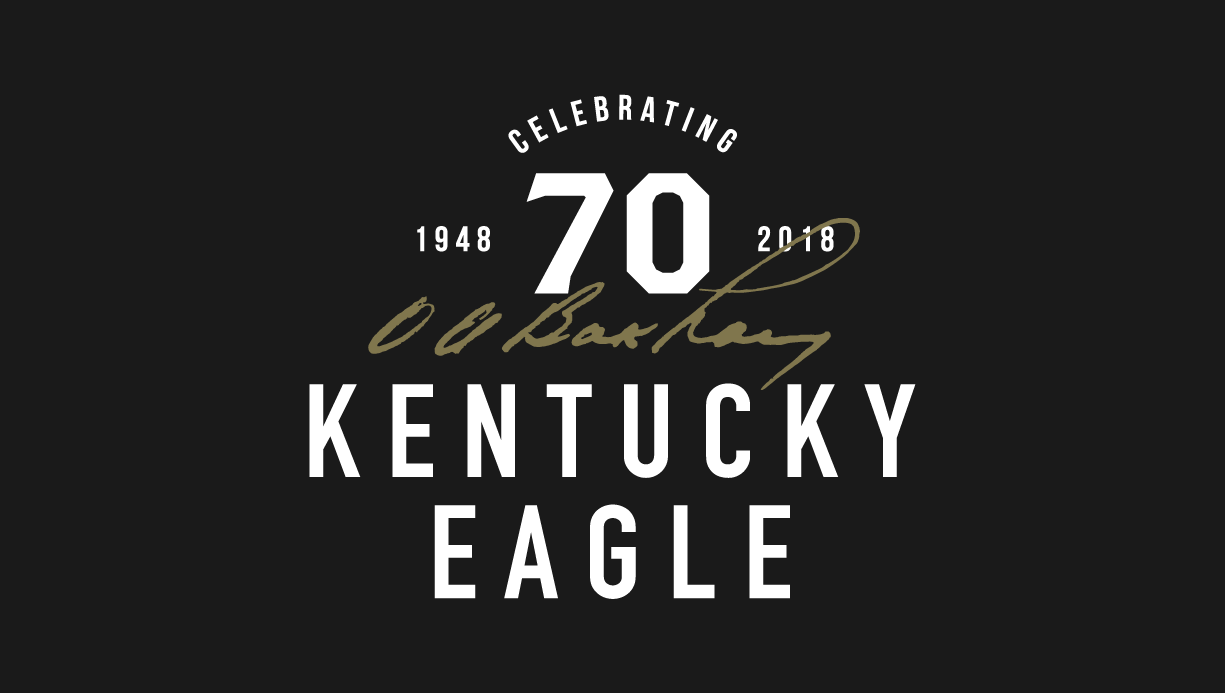
This logo is the guiding post for the Kentucky Eagle 70th Anniversary campaign. It conveys the future and past of our work and the character of our organization. It is our primary logo for all communications.
Inverse Color Logo
Inverse color logo
Logo Examples

Clear Space
Always keep a standard amount of white space, measured by the K in Kentucky, around the outlined logo.

Improper Uses
1. Do not stretch or skew the logo.
2. Do not pull apart the logo.
3. Do not color the logo.
4. Do not rotate the logo.
5. Do not add elements to the logo.
6. Do not adjust letter spacing in the logo.
7. Do not outline the entire logo. Only use the outlined version provided above.
8. Do not add drop shadows to the logo.

Colors
Color has an enduring emotional appeal. The Kentucky Eagle 75th Anniversary campaign colors are bold and confident. By pairing the colors consistently, you can harness Kentucky Eagle’s personality.

Dark Gray
RGB 26 / 26 / 26
CMYK 72 / 66 / 65 / 78
PANTONE 447 C
HEX #373A36

Gold
RGB 128 / 118 / 77
CMYK 47 / 43 / 76 / 18
PANTONE 450 U
HEX #7E785A
Typography
Brand Typefaces
Fonts express as much as words. They convey feeling, establishing a consistent and ownable visual language for Kentucky Eagle’s 70th Anniversary Campaign.
Bebas Neue Bold is the general headline font. The body copy font is Roboto Mono Light. Brothers OT Bold is the campaign headline font.

Headline

Body Copy

Campaign Headline

Language
Foundational Language
This language is the cornerstone of Kentucky Eagle 75th Anniversary campaign communications. It provides the keywords for all language. Use the taglines in broad external communications.
Company Tagline
Family Built. Locally Driven.
Campaign Tagline
Driving Good Times For 75 Years.
Campaign Collateral
Letterhead

Truck Wrap #1

Truck Wrap #2

Flag

TShirts

Koozies

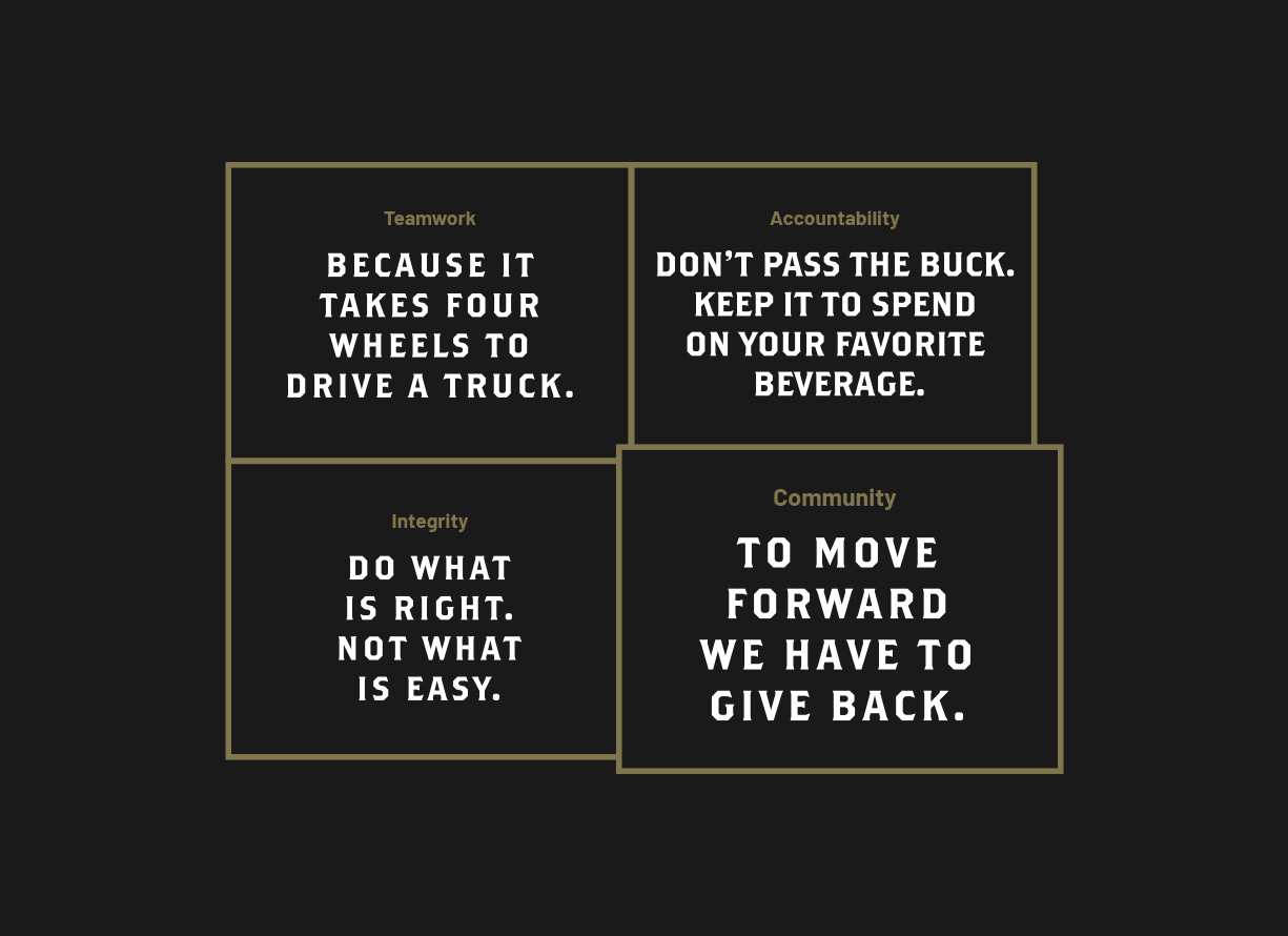
Core Values Graphic
Tate Russell
President
trussell@kyeagle.net
859.252.3434 x 6724